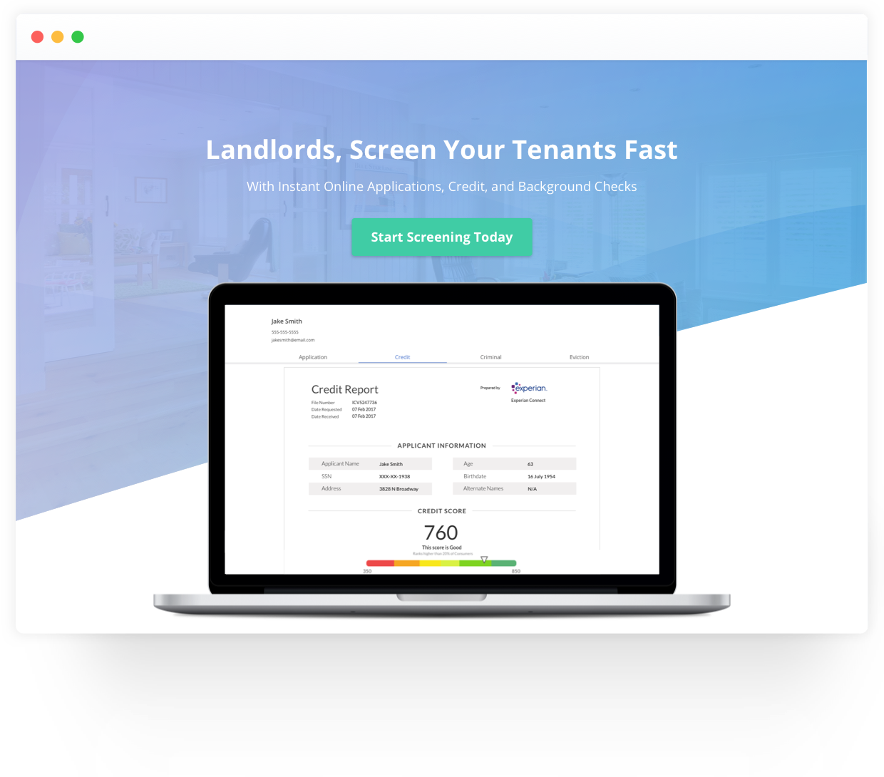
Overview
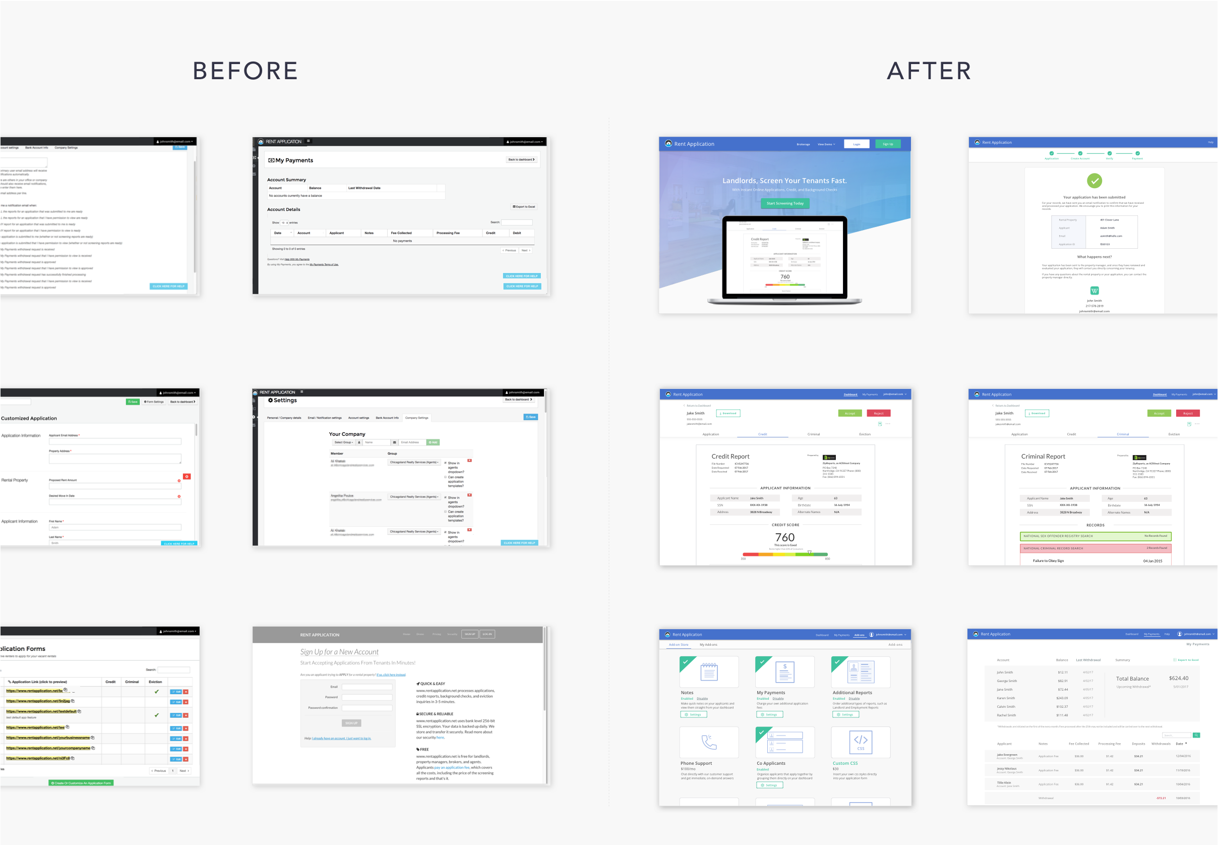
I was approached by Rent Application to redesign their platform, ranging from improving the site architecture and user experience to creating a new brand identity and design system across the platform. As the lead designer, I worked directly with the development team to bring the redesign to production.
Visual Framework
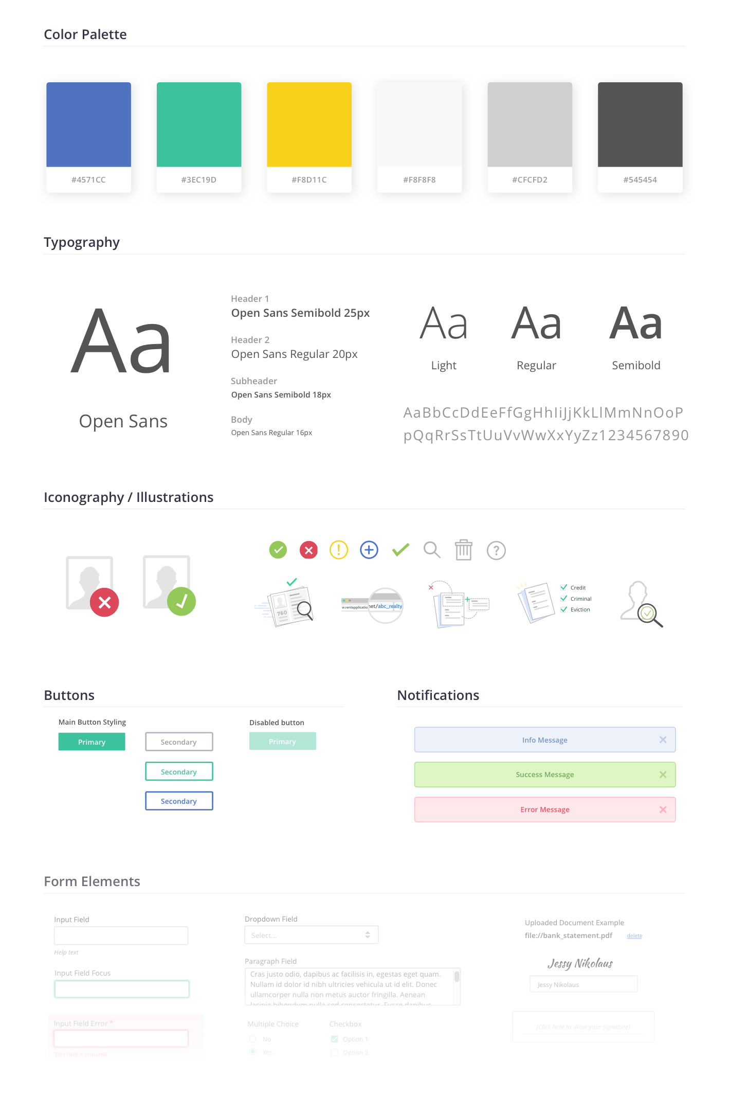
I worked with the CEO to develop a style for Rent Application that fit with the company’s vision. Through multiple iterations, I created a comprehensive visual framework that is used throughout the entire platform.
Tenant Screening Reports
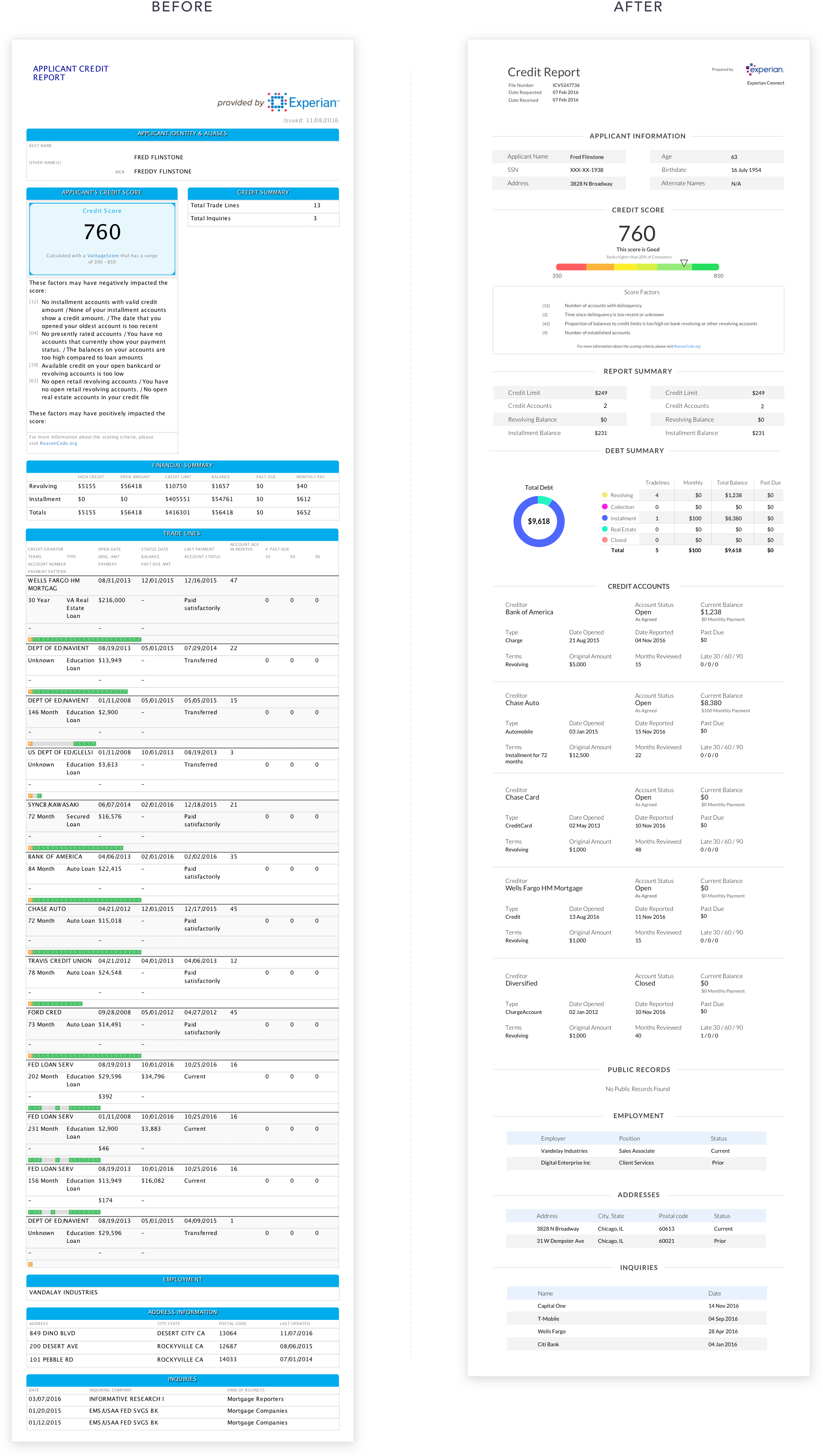
As part of redesigning the site’s main framework, I also redesigned all of the screening reports. In addition to updating the visual style to match the product’s new framework, I interviewed users to identify any areas of improvement in the redesign.
Visualizing Data
From my user interviews I discovered that landlords need to decide on an applicant in a short amount of time, thus they need to evaluate an applicant in a glance of the report. In my credit report redesign, I designed charts displaying an applicant’s credit score rank and total debt breakdown to help encompass the applicant’s financial summary in a quick scan.

Homepage
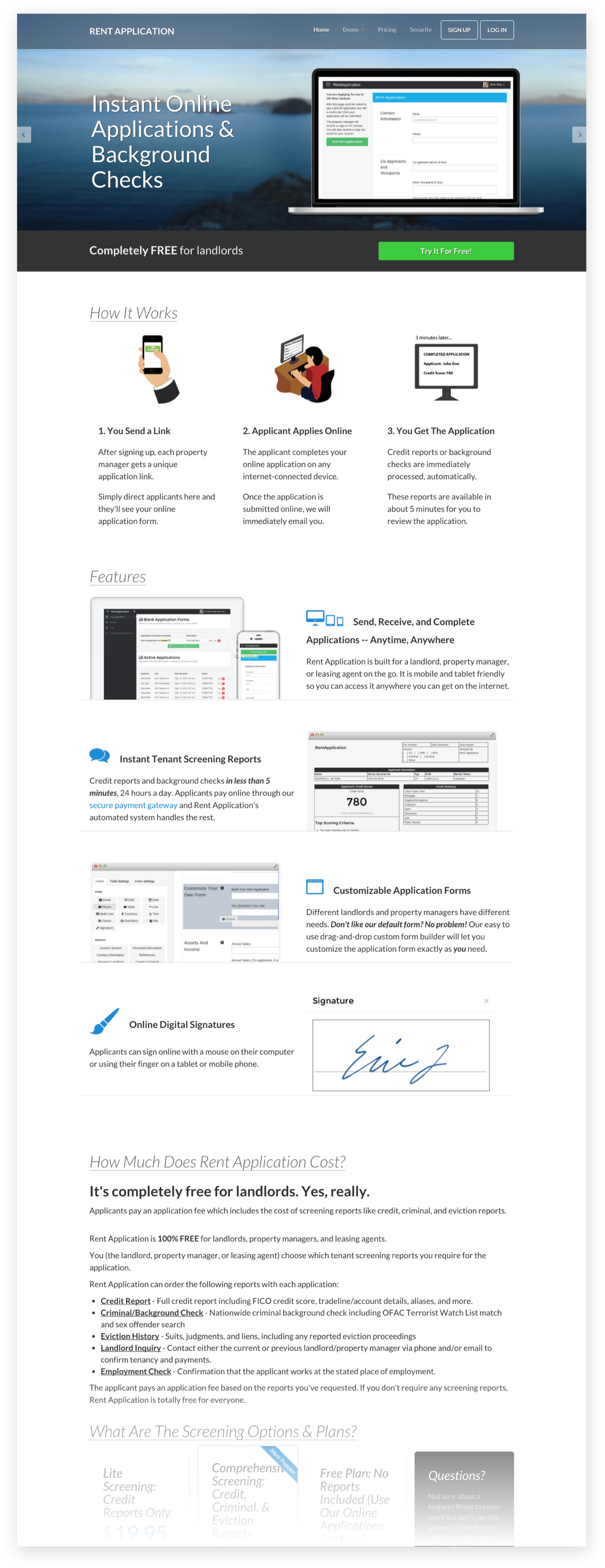
Rent Application’s original homepage was visually cluttered, their pricing was confusing, and users didn’t want to read through the paragraphs of text to understand the product.
Old Homepage
New Homepage Styles
My redesign uses imagery to more effectively highlight the product, clearly defines the pricing, and allows users to view our sample reports right on the homepage. I created multiple style directions for Rent Application’s homepage using a variety of different visuals to highlight the key product features, each aimed to reach different user types.
Style 1

Style 2

Style 3

Giving the Brand a personality
In creating a comprehensive brand identity for Rent Application, I also created custom illustrations across the site to add touches of friendly personality to the brand.

