Design Process
I worked on a team with a creative director and two UX designers to improve the user’s experience opening a new account on Oranj. This project was conducted over three Google design sprints following the process of design thinking, within an agile environment.
My Design Process
The Challenge
Oranj is introduced when financial advisors sign a new client. The first major task that the client completes is opening an investment account by filling out a form. This form requires the client to fill out important sensitive financial details, which tells the advisor how to plan the client’s financial strategy. Given the importance of this form, our goal was to help clients feel comfortable filling out the account form through transparency and trust.
After discussion with the Oranj team, we decided to focus our efforts over the next few sprints primarily on optimizing the client side grow a larger client base for the advisors, which would increase revenue for Oranj.
Surveying the Landscape
I started out this project by familiarizing myself with the financial management domain and creating a landscape review of the financial industry to understand where Oranj sits in the competitive market.
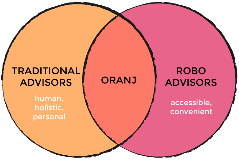
From our research, we found that there are two major options in the financial advising market: Traditional Advisors and Robo Advisors. While robo advisors offer accessibility and convenience through automation, traditional advisors offer a more personalized and holistic service with a real person who will take the time to get to know you.
Given that Oranj is a tool used between in-person advisor and their clients, the key opportunity for Oranj is to maintain that advisor-client relationship of trust and communication on an online platform, while also providing clients the convenience and accessibility to check their accounts anytime.
Research and Define
In order to evaluate the current state of the product’s overall usability, we conducted heuristic evaluations independently and then collectively discussed our findings to prioritize key usability issues to address:
Problem #1
Lack of error prevention
There was no confirmation to check with the user before officially submitting form.
Problem #2
Lack of visibility of system status
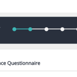
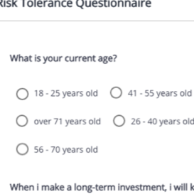
Long pages of content coupled with unlabeled progress bar made it difficult for users to know where they were in the page and within the overall form process.
Problem #3
Incongruent Layout
The form lacked visual structure and the categorization of questions was unclear.
Problem #4
Inflexible and inefficient use
The entire form must be completed in one sitting and did not allow the user to save progress and return at a later time.

In addition to examining the product through heuristic evaluation we also conducted usability tests with potential/target users to give us direct input on how real users interact with the product.
We then created an affinity diagram to look at any recurring trends and draw insights that would show us where we need to focus our efforts; Here are my main insights from our usability testing:
key insights

Lack of Guidance
There wasn’t a way for the user to directly talk to their advisor and many users weren’t comfortable moving forward in the process without additional help.
Form Structure
Users had to ‘switch’ their mental models for different types of questions that were asked because questions were not organized by any structure
Wording/Language
Users felt that the wording of questions were ambiguous and unclearly labeled.
Security/Trust
Users asked, “Why do they need this information?” because they weren’t given explanation why the form required certain information.
Lack of Knowledge
Users didn’t know all the financial terms and therefore felt uncomfortable answering questions
Understanding our users
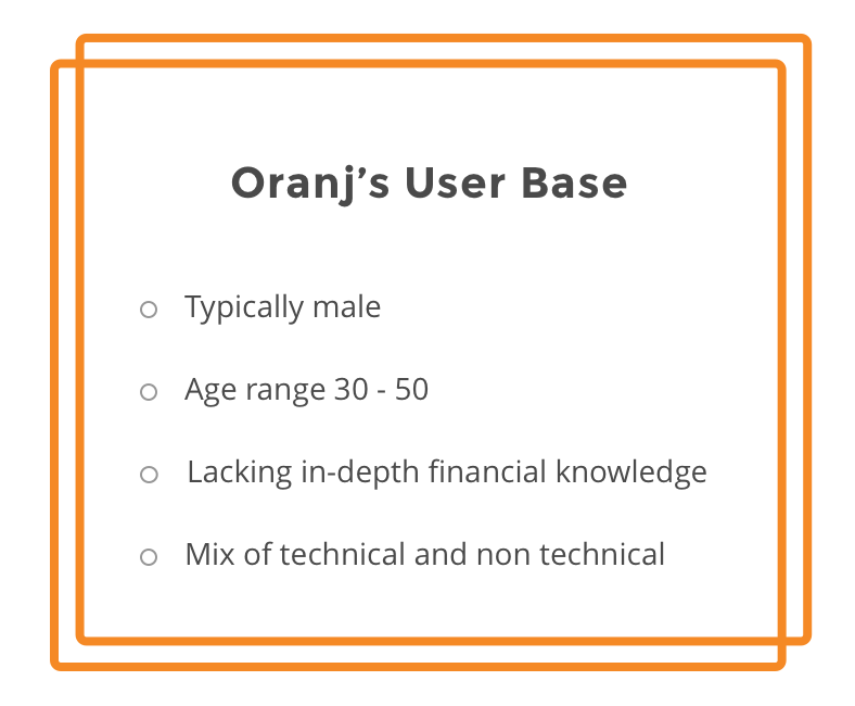
From Oranj, we learned about our target user demographic.Aside from usability testing, we conducted user interviews to understand our user’s goals, motivations, and their relationship with advisors. From this we understood that users generally lack financial understanding, so they look for guidance and throughout the process.
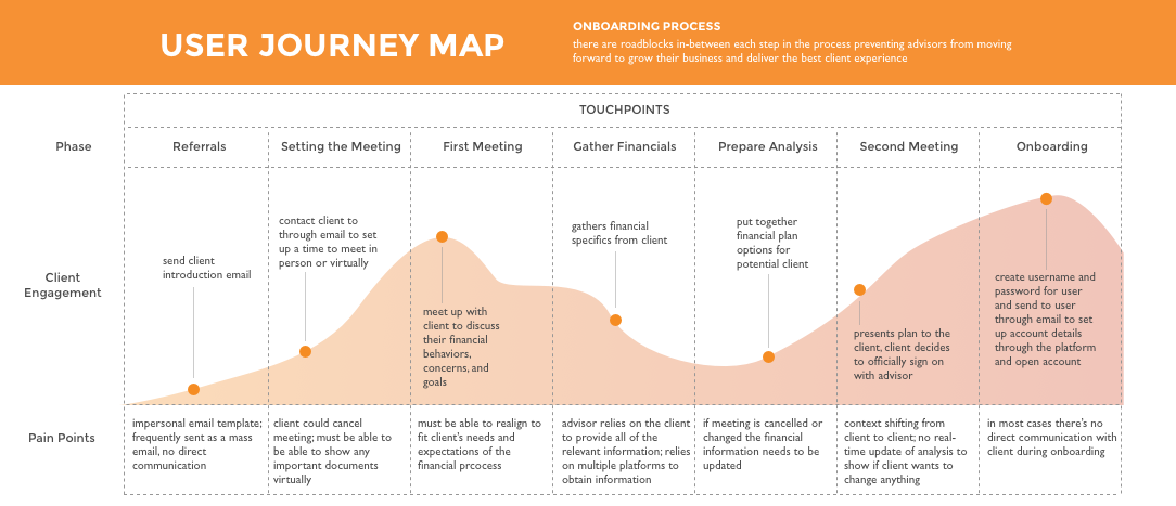
We also conducted some subject matter expert interviews with financial advisors to further understand process of onboarding a client, and client engagement level, and understand the pattern of communication between advisor and client.
From the interviews, I also created a journey map to help me and the Oranj team empathize with our users through their process in a visual way.
Using the results from the heuristic evaluation, user interviews, usability testing, we defined the core problem of the user’s experience with Oranj:
Design Guidelines
As a way to integrate user insights into an actionable part of our process, we established design principles to help us guide our designs with the user in mind:

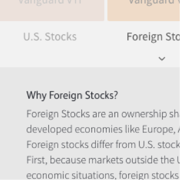
Explain any jargon
Clarify the financial terms in a way that any user can understand.

Build trust
The form requires sensitive and personal information, thus it's important to assure the user that their information is taken seriously.

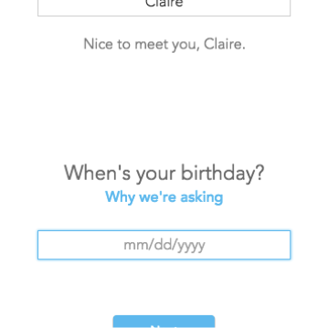
Illuminate a path
Guide the user throughout the process and allow them to reach out for help if they get stuck.

Minimize pain
No one likes filling out forms; make the process simple and don’t bombard the user with extraneous information.
Brainstorm
With our problem statement and design principles in mind, my team and I diverged to individually come up with solutions. I delved into web form design research to understand web form best practices and looked at a multitude of financial platforms. Here are some of my insights:
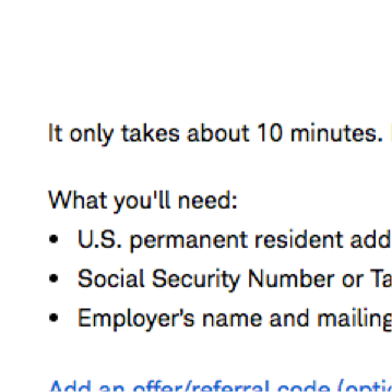
Prepare the user
Let users know up front what materials they will need to complete the form
Educate the user
Teach the user what they need to know to be able to answer confidently
Be transparent
Explain why certain information is required and what it is used for to build trust with the user
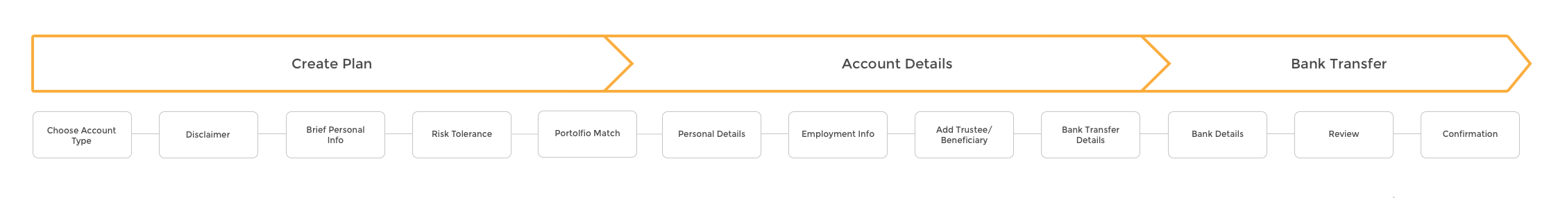
Restructuring the flow
Throughout the usability testing, I found that users lost track of their progress throughout the form, which made the process feel longer. I wanted to create a better way of mentally chunking the information for users, so I mapped out the structure of the flow that helps streamline the process for users by creating high level categories for users to know where they are within the process.
Prototype/Iterate
We tested our concepts using paper prototypes to quickly gain feedback on our designs before investing too much time and energy.
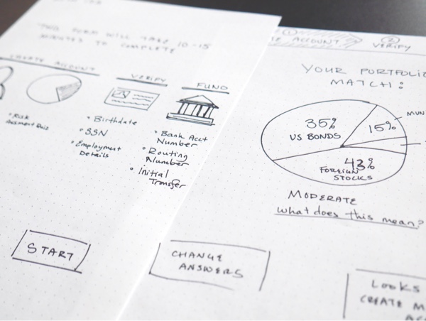
A/B testing the prototypes showed that users preferred the humanized language as well as reorganized structure of the form, so we iterated on our prototypes and refined them based on our users’ feedback.
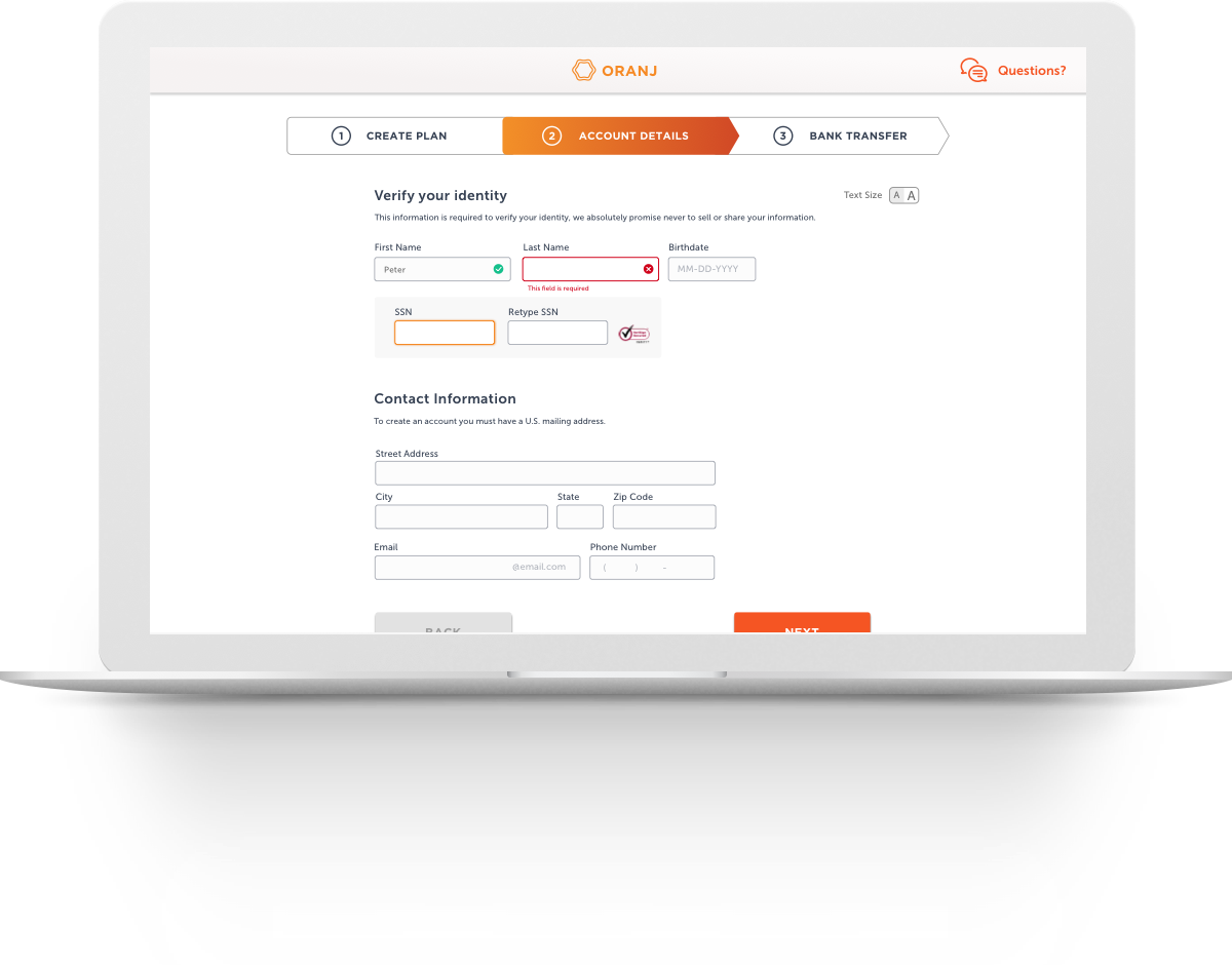
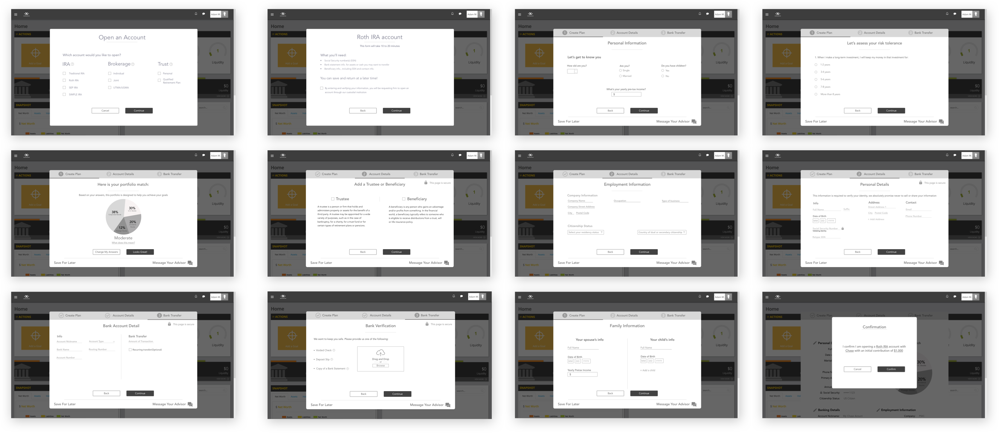
Final Prototype
We implemented the results from the feedback into a mid-fidelity prototype and tested it against Oranj’s original product to validate whether our solutions were able to help the users complete the form with more ease and accuracy. Here are screens from the final prototype delivered to the client:
Visual Direction
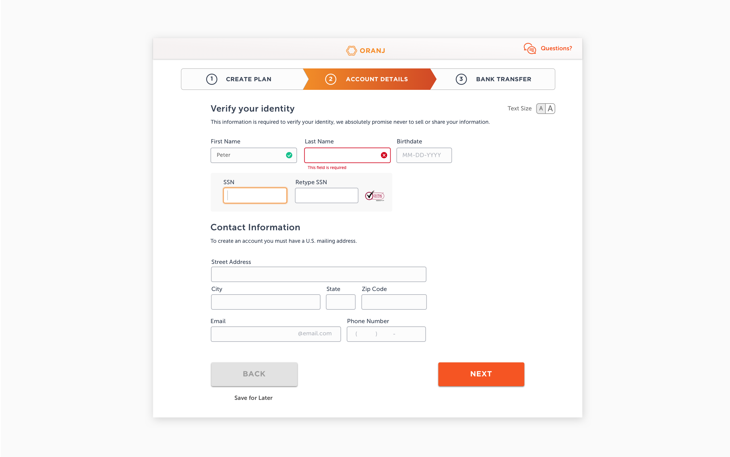
I created a high-fidelity screen to capture the UI direction of the prototype. Oranj's main users are in the 30s-50s+ age range, thus an aspect that I wanted to address was readability concerns. I designed the interface with accessibility standards in mind: avoiding font sizes smaller than 16 pixels, using large buttons, high-contrast color combinations, and allowing users to manually adjust text size.
Next Steps
As we wrapped up the project, one future consideration we wanted the Oranj team to focus on was to create an onboarding process. We discovered through our research that a new user is introduced to Oranj is through an email link from the advisor. Because the advisor isn’t present during a new client’s introduction to Oranj, the client may not see how to fully use the product, or it’s full capability, which reflect the full range of services provided of the advisor. By reimagining the user's initial introduction the platform and guiding the user through an onboarding process that highlights the features of the platform, it can help garner the user’s trust to the platform before they even fill out the form.